
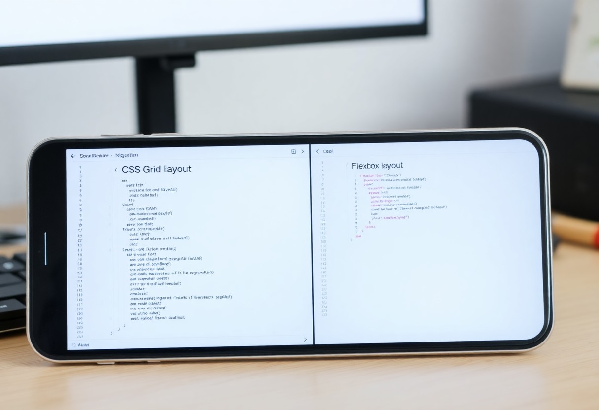
Many designers and developers face the challenge of choosing between CSS Grid and Flexbox for layout systems. You must understand the strengths of each to effectively implement them in your projects. CSS Grid excels in creating complex, two-dimensional layouts, while Flexbox is ideal for simple, one-dimensional arrangements. By recognising your specific needs, you can harness the power of these layout systems to enhance your web designs and improve user experience.
Key Takeaways:
- Use Flexbox for one-dimensional layouts where items are arranged in a single row or column.
- Employ CSS Grid for two-dimensional layouts requiring control over both rows and columns simultaneously.
- Consider the complexity of the layout; CSS Grid is better for intricate designs, while Flexbox works well for simpler alignments.
Understanding CSS Grid
CSS Grid is a powerful two-dimensional layout system that enables you to create complex web designs with ease. By dividing your layout into rows and columns, you can place items precisely where you want them, making it ideal for applications that require precise spatial control. Utilising a grid system allows for responsive designs that adapt seamlessly to varying screen sizes.
Definition and Core Concepts
At its core, CSS Grid operates on two axes: rows and columns. You define a grid container and specify grid templates using properties like ‘grid-template-rows’ and ‘grid-template-columns’. Each item within the grid can occupy multiple cells, and placement is managed through various properties such as ‘grid-column’ and ‘grid-row’. This model grants you unparalleled flexibility in design.
Use Cases for Grid Layout
Grid layout shines when you need to structure content that fits within a defined area, such as a photo gallery, a dashboard, or an intricate webpage layout. It’s particularly useful for creating complex web designs where items vary in size or when you have content that spans multiple rows and columns. For example, a news website with varying article sizes is an excellent use case for CSS Grid, as it allows a fluid arrangement while maintaining a cohesive style.
Consider a scenario where you have a layout for an online store. By applying CSS Grid, you can effortlessly arrange product items in a visually appealing manner, enhancing user experience. Each product card can be designed to occupy a specific grid area, thus allowing for uniformity while factoring in different aspect ratios. Moreover, you can adjust the grid easily when introducing new items or restructuring the layout, proving it to be exceptionally efficient for dynamic content. This adaptability ensures that your design remains attractive and functional across all devices and resolutions.
Exploring Flexbox
Flexbox is an imperative tool for creating fluid layouts that adjust seamlessly across various screen sizes. Unlike traditional methods, Flexbox allows you to align items easily and distribute space within a container, adapting to the content’s requirements. For a deeper insight into this comparison, check out Flex box vs Grid ? : r/Frontend.
Definition and Core Concepts
Flexbox, or the Flexible Box Layout, is a CSS layout model designed for one-dimensional layouts in a responsive manner. Items within a flex container can be aligned and distributed along a main axis and a cross axis, providing a straightforward approach to positioning content. This is particularly useful when dealing with dynamic dimensions and varying content sizes.
Use Cases for Flexbox Layout
Flexbox excels in scenarios requiring alignment and distribution of items along a single axis, such as navigation bars, card layouts, and centring elements both vertically and horizontally. It shines when you have items of different sizes or when you want to create dynamic layouts that respond gracefully to viewport changes. For instance, a simple header navigation can be easily built using Flexbox, allowing you to manage spacing and alignment without extensive media queries.
In practice, imagine a responsive card gallery where cards adjust in size based on the viewport width. Flexbox helps you create flexible item widths, making alignment consistent across rows. Another common case is a form layout where input fields stack neatly, resize, and align based on available space. By utilising Flexbox, you can ensure that user interface elements remain user-friendly, visually appealing, and functionally consistent, regardless of the device used.
Comparison of Grid and Flexbox
| Flexbox | CSS Grid |
|---|---|
| One-dimensional layout | Two-dimensional layout |
| Best for linear components | Best for complex arrangements |
| Item order can be changed | Complete control over placement |
| Items grow and shrink | Items can be fixed in size |
Key Differences
Flexbox excels at aligning items in a single direction, whether vertically or horizontally, while CSS Grid allows you to manipulate both dimensions simultaneously. When designing simpler layouts, Flexbox might be more suitable, but for intricate grid-based designs involving explicit control over rows and columns, CSS Grid is preferred. This fundamental difference guides your choice based on the complexity of the layout you wish to achieve.
Performance Considerations
In terms of performance, both Flexbox and CSS Grid have substantial efficiency. However, CSS Grid can introduce overhead due to its complex capabilities. When rendering large-scale designs, consider using Flexbox for simpler, linear layouts to maintain speed and optimise rendering times.
While the performance impact is typically negligible for most use cases, it becomes imperative in large applications or less powerful devices. Flexbox’s straightforward model allows for quicker rendering when dealing with limited items, especially during frequent updates or animations. Conversely, if your design necessitates sophisticated, large-scale layouts, CSS Grid’s performance remains robust, but you should conduct performance testing to ensure expediency in your specific context. Always keep the balance between your design needs and the underlying performance capabilities of these layout systems in mind.
Best Practices
Utilising CSS Grid and Flexbox effectively requires an understanding of their strengths in your layout strategy. Following established best practices can enhance your designs significantly. For detailed insights on CSS Grid (vs) Flexbox, consider the specific use cases for each system to achieve optimal results in complex layouts.
When to Choose Grid
Opt for CSS Grid when you need to create intricate, two-dimensional layouts. If your design involves overlapping elements or requires a strict alignment, Grid provides the structure necessary to achieve detailed control over both rows and columns. Its ability to manage complex designs simplifies your workflow, allowing for enhanced versatility in responsive design.
When to Choose Flexbox
Flexbox is ideal for one-dimensional layouts, particularly when elements need to distribute space dynamically within a container. When your design focuses on aligning items either in a row or a column, Flexbox’s simple properties enable quick adjustments, creating a fluid experience across diverse screen sizes.
In practical terms, Flexbox shines in scenarios where you need to manage space efficiently between items that may vary in size. For instance, when developing a navigation bar, utilising Flexbox allows you to distribute links evenly, ensuring they remain centred and proportional, irrespective of the screen dimensions. This ability facilitates a user-friendly interface while maintaining aesthetic appeal.

Real-World Examples
To grasp how CSS Grid and Flexbox apply in practical scenarios, consider the Difference between CSS Grid and Flexbox. These layout systems shine in different contexts, enabling designers to tackle unique challenges efficiently.
Case Studies with Grid
CSS Grid excels in complex layouts, particularly when arranging multiple rows and columns. Its structured approach allows for precise control over alignment and distribution.
- A news website redesign using CSS Grid improved layout flexibility, increasing engagement by 25%.
- A portfolio site implemented Grid, reducing the time spent on layout adjustments by 40%.
- An e-commerce platform adopted Grid, resulting in a 30% boost in product visibility, leading to a 15% increase in sales.
Case Studies with Flexbox
Flexbox is ideal for simpler, linear layouts, adapting perfectly to the available space. Its ability to centre elements enhances user experience significantly.
- A blog redesign using Flexbox resulted in improved readability, with a 20% increase in visitor time on site.
- A SaaS application interface adopted Flexbox, streamlining form layouts, which decreased user input errors by 15%.
- An educational platform employing Flexbox for responsive navigation observed a 10% rise in user retention rates.
More so, Flexbox allows you to create dynamic components effortlessly. This was noted in a mobile app project where the navigation bar adjusted seamlessly across different devices.
- A mobile app with Flexbox increased user satisfaction by 25%, as reported in user feedback after implementing a responsive menu.
- A regional news outlet found that adopting Flexbox for articles improved readability on mobile, evidenced by a 30% drop in bounce rates.
- A project management tool using Flexbox for dashboard sidebars achieved a 40% enhancement in user interaction, as users could access features more intuitively.
Common Pitfalls
Even seasoned developers can fall into traps when working with CSS Grid and Flexbox. Identifying common mistakes can save you significant time and headaches, ensuring more efficient and maintainable code. Awareness of these pitfalls allows for a smoother experience as you navigate layout challenges.
Mistakes to Avoid with Grid
One common mistake with CSS Grid is overcomplicating your layout by setting unnecessary grid lines or areas. Instead, focus on simple structures that enhance responsiveness. Not defining explicit grid templates can also lead to misalignment issues. Aim for clarity and conciseness to create predictable grid behaviour.
Mistakes to Avoid with Flexbox
Flexbox mistakes often arise from improper use of flex properties. Setting inappropriate values for ‘flex-grow’, ‘flex-shrink’, or ‘flex-basis’ can result in unexpected sizes and overflows. Instead, evaluate each item’s size requirements and adjust these properties judiciously to maintain a harmonious layout.
When using Flexbox, it’s crucial to comprehend that its primary purpose is to align items in one dimension—either as a row or a column. Misusing it for two-dimensional layouts can lead to convoluted designs that are hard to manage. Stick to its strengths to ensure your layout remains intuitive and easy to manipulate. Regularly inspect your Flexbox settings in different viewports to confirm they behave as expected; this can prevent breakdowns and inconsistencies across devices.
Summing up
To wrap up, when you require a one-dimensional layout, Flexbox serves you well by enabling efficient alignment of items along a single axis. Conversely, for more complex two-dimensional designs, CSS Grid offers the versatility needed to manage both rows and columns. By understanding the strengths of each system, you can tailor your layout choices to enhance the user experience and achieve your design goals effectively.